Colour Packing
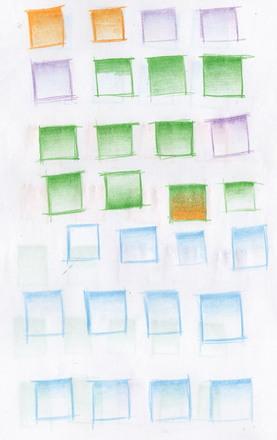
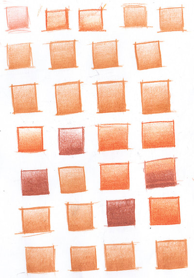
The imagery shown is part of a task set with the purpose of gaining understanding and technique with what is known in tattooing as ‘colour packing’. Colour packing is the term giving to the process of inserting pigment into the skin to saturate the surface area with ink so that there is no negative space showing through.
The task was to draw a few pages of small squares, and colour them in using a tight circular motion repeatedly until they became fully saturated. The purpose of the task was the process - the motion created with the coloured pencil is transferable to a tattoo machine. When saturating an area using colour pencil, the stroke may be back and forth, however when tattooing, this motion would cause damage to the skin. This could result in discomfort for the person being tattooed, and more damage than necessary to the surface, thus a lower quality tattoo as a result.
It was initially difficult to achieve much tone on the paper, due to the quality of the lead of the pencil. After changing to a higher quality pencil, the effectiveness was increased, and gradations where then able to be explored through repeating the cir- cular motion on some areas of the square more than others. Though the conventional method with traditional media would have been to pres harder to increase pigment, in tattooing gradation would be created by attempting to keep a consistent pressure but working faster for areas intended to be lighter.
The reason less ink is inserted into the skin is because the machine is repeatedly moving the needle up and down in relation to amount of volts that are running through it (controllable by the power supply). A faster hand motion means that less ink is inserted into the skin, thus a gradation of tone may occur. This was considered and replicated when completing this exercise, with gradation created by a faster moving hand rather than applied pressure.
Script
The imagery shown here is a sample of the practical research produced as part of a task set in order to gain knowledge on how to create script and lettering. Script and lettering is common subject matter within tattooing, however many tattooists will use a computer generated font and simply make a transfer from the printed word. This form of lettering tattoo is often completed by the most junior member of the team, as it is often understood as the least desirable to tattoo and least artistically challenging. Tattooing script is almost seen as a right of passage into a tattooing career.
As Triplesix Studios are an establishment with a range of artists with a variety of specialisms, a number of artists approach script with a sense of pride and importance comparable to that of a calligrapher or sign writer. As my position within the studio is that of an apprentice, it is understood that I will be executing many of the lettering tattoo’s in the early stages of my career. My mentors set me the task of drawing script manually is order to provide me with the tools needed to create script that adhered to the standards of design that is prominent within the studio.
The process was broken down into steps by one of the artists, Dan Hartley. Two parallel straight lines where drawn, with a gap of approximately 2 inches. 2 lines where then drawn above and below, with a gap around 50% of the size. The lines acted as structural frameworks for the lettering, with the original lines as the prima- ry guidelines. Small slanted ovals where then drawn within the primary lines, which would act as the basis for lower-case letters. Larger ovals that reached the top of the secondary line and bottom of the primary lines where drawn as the basis for capital letters. These guidelines could take whatever shape necessary to accommodate for the area that would be hypothetically tattooed upon.
It was advised to approach each letter as a shape, and ‘draw’ the script, rather than write it. It was suggested to begin with the stem of letters (such as ‘b’ and ‘p’) that fit within the guidelines, to keep the remainder of the letter shapes consistent in size, as they would be produced inside the ovals. Letters such as ‘y’ where kept consistent throughout the use of bottom guidelines, though it was pointed out that the guides should not dictate the visual, but inform. Once a word had been drawn, more decorative elements could be added and to strengthen the visual elements of piece and make it more conventionally interesting as a tattoo. The image included that depicts orange pencil is a scan of the demonstration produced by Dan, with the remaining images showing a number of my attempts. The larger image also depicts the beginning of my attempted adaptation of calligraphy into ‘tattoo-able’ lettering, referencing the work of Manny Ling as a basis of exploration.
The task gave me an insight into the process of production of script, allowing for skills development that would make a traditionally undesirable task engaging as a designer.
Adam McDade
Illustrator, Tattoo Apprentice, and PhD Research Student


 RSS Feed
